Ooh là là, the Knight Returns!
Great brand design from the Paris 2024 Olympics and a smart u-turn by Burberry.
I enjoy interesting brand design and this month I saw two pieces of work that made me smile. One is new design work for the Paris 2024 Olympic games, the other is a return to it’s heritage by Burberry.
In 2018 ( Pica #034) I wrote scathingly about the blandification of the Burberry brand elements under the creative direction of Riccardo Tisci. Specifically, I mourned the demise of the Equestrian Knight logo and the graceless horror of the brutalist wordmark that I considered wildly inappropriate for a brand with over one hundred and sixty years of history. I believe Burberry’s new chief creative officer, Daniel Lee, has similar thoughts to mine because the fashion house has a new design identity inspired by the past.

The sans-serif wordmark is gone, replaced by an elegant serif design and the knight is back with a crisp new modern-retro-heritage design. Talking about the restyle with British Vogue Daniel Lee said, “I don’t know if this is the right way to say this, but more than surprising people, I really would like them to see the new vision and feel reassured – like, ‘Oh, yeah, this makes sense: This is what Burberry should be.’” I couldn’t agree more.
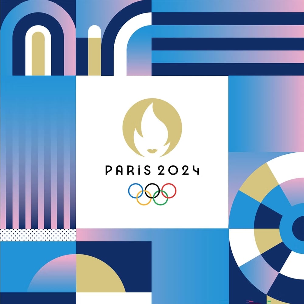
The logo and visual identity of the Paris 2024 Olympics were unveiled in 2019 and I immediately fell in love with the logo that combined a gold medal, the Olympic torch and a fabulously Parisienne image of a female visage representing the French Republic. I also enjoyed the idea that, for the first time, the logo would be identical for both the Olympic and Paralympic Games. Now the full identity design has been revealed and it is stunning. For me, the standout piece is a set of pictograms. Julie Matikhine, Paris 2024 brand director, calls them “blazons” a word that derives from blason, the French word for shield, that signifies a heraldic coat of arms. The designs are modern, illustrative and easily identifiable.
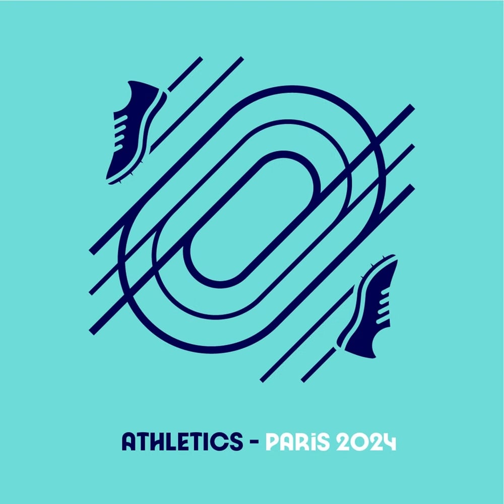
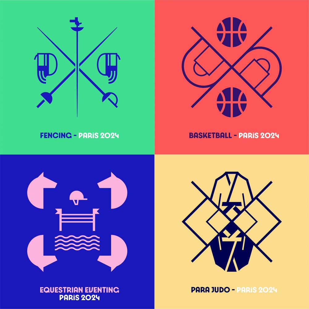
Each pictogram is composed using an axis of symmetry and a representation of the characteristic elements of the sport that it portrays. There are 70 blazons in total, with eight of these shared by the Olympics and the Paralympics. This was made possible by deciding to omit human figures from the designs, focusing instead on the environment and equipment of each sport. Simply excellent work.
