A knight and a knave.
The Burberry brand receives a major renewal that destroys its heritage.
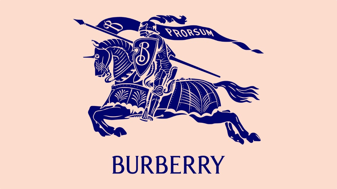
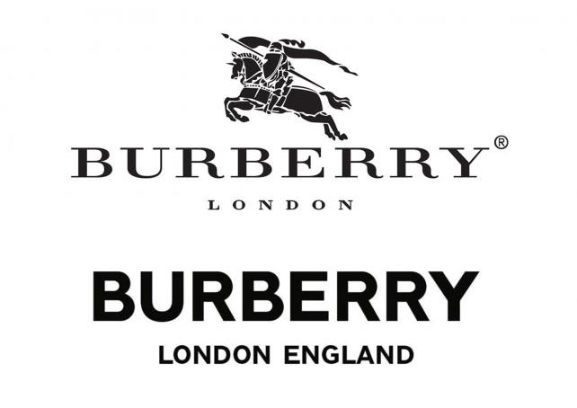
Burberry’s new brand design is shown on this page together with the old one. Whether you prefer the original or the new design is beside the point, what is shocking is the absolute lack of continuity (and originality).
An official Burberry press release from March 1st announced the arrival of a new CCO, the man responsible for the redesign, Riccardo Tisci. In the press release he is quoted as saying, “I have an enormous respect for Burberry’s British heritage and global appeal and I am excited about the potential of this exceptional brand.”
His radical redesign of the Burberry brand is a symbolic cancelling of it’s heritage. Maybe this is a belated, over-reaction to the Burberry brand being adopted by "chav" and football hooligan culture in the UK at the start of the millennium, but that has passed and over the last decade the brand doesn’t seem to have had any major issues.
Brand restyles are sometimes necessary to refresh and revitalise a design. They are also useful to signal a broader change in product or brand values and attitudes. An established brand design is an identifier, a symbol that is instantly recognizable and connects past consumer experiences with current and future experiences. Burberry is a 160 year old brand that is modern, relevant and successful. Being a fashion brand, the product designs change constantly, the only continuity is the brand design. History can’t be faked and if you have a strong heritage, it is wasteful to abandon it.
A great example of keeping a classic design contemporary is Johnnie Walker’s Striding Man. The original design is over a hundred years old but restyles have kept it relevant. Earlier this year a female ‘Jane Walker’ version of the design appeared on Scotch bottles. Diageo, who own the Johnnie Walker brand, do a great job of keeping this classic brand relevant and modern while respecting and capitalizing on it’s venerable heritage.
There is a bright note in the Burberry redesign, the Thomas Burberry monogram that accompanies the new logo, this too has been created by renowned graphic designer and art director, Peter Saville. It is a distinctive repeating texture, with an original look that nicely balances modern and traditional. I presume it will be used in conjunction, and in some cases in substitution, of the traditional Burberry tartan that has sometimes proven difficult to protect against imitations.
The Equestrian Knight logo, a fatal casualty of the Burberry redesign, began to gallop on Burberry products in 1901 and the banner he carried for 117 years contained the latin word ‘Prorsum' meaning 'forwards'. I think this leap forward for the Burberry brand design is a risky and potentially wasteful one but, maybe, it’s a stunt to create buzz about the brand ahead of the viewing of Tisci’s first Burberry collection in September. In just over a month we will see his new vision for #newera Burberry, personally I hope the Equestrian Knight will be a (restyled) part of it.