Looking good.
I’m a fan of the new brand identity that Wolff Olins has created for GSK.
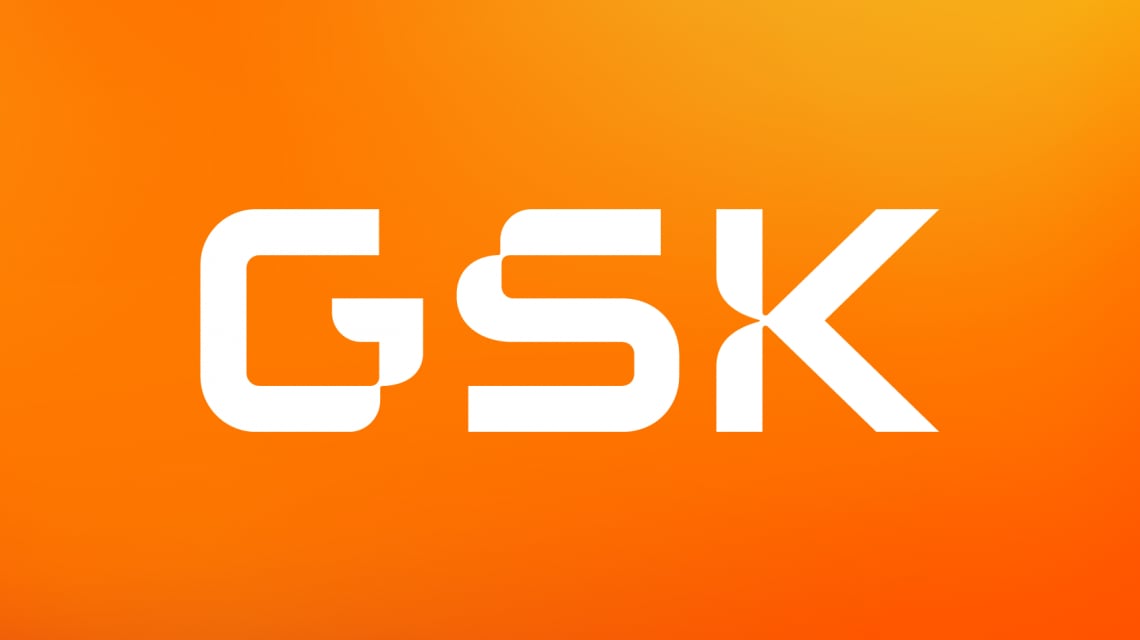
When I learnt that the GSK logo was being reimagined I braced myself for another backward step because the current design is one of the very best, not only among pharmaceutical brands. The distinctive and compact orange emblem originated in 2000, following the merger of GlaxoWellcome and SmithKline Beecham which formed the present company GlaxoSmithKline, known as GSK. The version used until now was developed in 2014 by Futurebrand, who managed to improve on the original design with a very tasteful and effective restyle. So, to recap, a good design that, through twenty-two years of consistent use, became one of the most recognisable in the industry. Hard to beat.
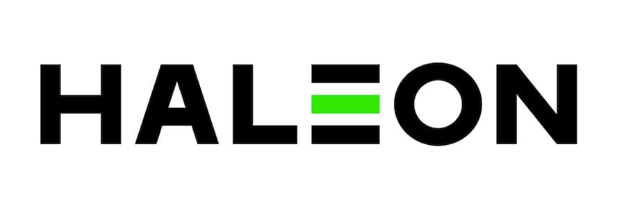
Wolff Olins have done an outstanding job with the new GSK brand identity. As always, part of the success lies in the brief they received. The motivation for the new logo is to signal a significant change in the company. The consumer healthcare business will be spun off into an independent company and brand (Haleon) while the entity named GSK will focus entirely on biopharma innovation. The new focus not only justifies a new image; it gives the design something specific to convey.
The lively orange colour is maintained as the link to the brand’s heritage while most everything else has changed. The typographic design of the three letters is now uppercase and has indent flourishes that interrupt the underlying font style that reminds me of NASA and, consequently, science. The indents are unexpected and vaguely evocative of biological shapes, making the design original and, I feel, making it hint to the concept of discovery. Interestingly, the lettering maintains legibility when reproduced in small size; however, as it loses the detail of its indents it starts to resemble a pixel font - possibly, an intentional nod at the persistent collective infatuation with all things ‘tech’.
Brand identity is more than just a logo, of course, and the examples I’ve seen of the new identity in use are very slick. It feels clever, simple yet sophisticated. For example, there is a 3D animation where the letters are fused together in a shape that, like a folded protein, shows different arrangements when viewed from different angles so, as the object rotates, it reveals the G, S and K.
“Today, GSK is a different company from the GlaxoSmithKline that launched in 2000, and the global context around it has shifted radically,” said David Stevens, executive strategy director at Wolff Olins, while revealing the design. “So, whilst GSK are keeping the same name, we wanted to bring to life the company’s ‘Ahead Together’ purpose, which is all about innovation through collaboration. The new logo helps to do this by feeling more precise, more scientific and technologically advanced – and it features numerous curved forms that create an ‘orange thread’ across the rest of the brand.”
The new-look GSK has evident intellectual influences and meanings, complemented by a distinct dynamism and emotion. A job very well done, that provokes an urgent question: how come the Haleon logo is so uninspired?