Sanofi?
The bird of hope is dead, usurped by a question mark.
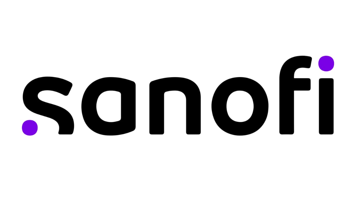
Sanofi have revealed a new logo design. It’s simple, nicely balanced, technically well executed. In a perfect world, it’s a decent solution. However, in terms of image, the world is less than ideal for the entire pharmaceutical industry. Despite helping the majority of people to live longer and healthier lives, pharma has a terrible reputation. It’s easy to point a finger at nefarious outliers - like Purdue, Theranos, Turing Pharmaceutical - and dismiss them as exceptions. But, tragically, the public image of the entire sector is defined by greed, deviousness and secrecy. Which makes the new Sanofi logo an unfortunate choice because part of the design is truncated, making it appear to be partially submerged, and it contains a clear allusion to a question mark. While it does not scream ‘devious and secretive’ it is vulnerable to interpretations of that kind.
The following is from a Sanofi press release dated February 3, 2022.
“The new logo is a representation of Sanofi’s new purpose and ambition, which is inspired by the simple and motion-oriented codes of the tech industry. The two purple dots embody the scientific journey between a starting point – the curiosity of questioning the status-quo and wondering “what if?” – and a finish line – the eureka moment where innovative solutions are unlocked to impact people’s lives.”
I’ll concede that an eye biased by the press release might detect the “what if?” narrative and the start-end points embedded in the design. The reality is that most eyes that see this logo will be biased by their mistrust of pharma companies and they will not see this inspiring story. Category is context, and context is like karma - all your bad deeds and those of your competitors can and will weigh against you.
Last year, according to RepTrak, Sanofi had the best reputation among pharma brands. A reputation associated with the ‘bird of hope’ symbol that has accrued value and meaning for more than a decade. To discard that symbol is bold. To replace it with a question mark is puzzling.