Good logo, bad logo.
The Renault logo redesign is a rare ray of sunshine, especially compared to other recent redesigns.
I think the new Renault logo is very nice. It’s dynamic, simple yet interesting. Designed to work equally well on the front of a car and as a tiny icon on a small digital screen, it looks sharp and contemporary while fully respecting the heritage of the diamond shape that has been associated with Renault since 1925 (the current version owes much to a design introduced in 1975).
I’m glad for this good piece of graphic design work from Renault for two reasons: it shows that not all big brands have lost the ability to commission good graphic design and it allows me to go off on a rant about some of the stuff I’ve recently seen.
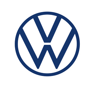
Voltswagen: apparently their April fools name change was not a great success. Pity. If I was running a company named by Adolf Hitler I’d be itching to change the name, also following diesel-gate and a recent pledge to go 100% electric by 2026 I’d go all-in with Voltswagen as a new name. Besides, it doesn’t mess with the iconic VW device… which coincidentally has just been messed with (redesigned). Unfortunately, the new design looks old (and much worse still) spindly, weak and unbalanced (the lower part of the W that doesn’t touch the circle is a distinctive but poorly judged decision that has consequences for the rest of the design).
Verdict: bring back the 1967 version.
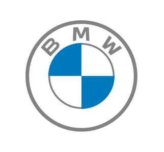
BMW: another truly distinctive auto brand that felt it needed to follow the trend of simplifying its design. Pity that the result is spindly, weak and unbalanced… oh wait, I detect a trend, maybe that was part of the design brief. The outer ring is ‘transparent’ which makes legibility unpredictable and compromises the solidity of the logo. Simply put, any BMW design without the black outer ring is a fail.
Verdict: keep the new design but make the outer ring black.
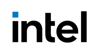
Intel: with only their third logo design since 1968, a once-dominant and now struggling chip builder goes for a newer, simpler, and more generic logo. I wasn’t a fan of the old Intel logo and I’m happy to see it go, but for it to be replaced with something so nondescript and lifeless is depressing.
Verdict: start again, putting the word ‘distinctive’ in the brief.
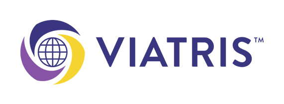
Viatris: born from the merger of Mylan and Pfizer’s Upjohn division this is a global, off-patent drug production and commercialisation giant.
In the past, I’ve done work for Mylan so I've used and admired their logo. That is gone and the Viatris design that replaces it is a sad, banal monstrosity. The globe device looks like something a Bond villain would use for his organisation and the lettering is unbalanced. Admittedly as a sequence of letters, Viatris is hard to space pleasantly, especially when all-caps but there are solutions, for example, avoiding all caps.
Verdict: sell the Viatris name and logo to Eon Productions and try something else.
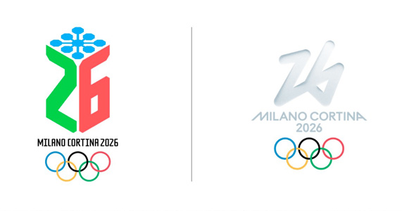
2026 Winter Olympics: this design, named Logo Futura, received 74% of the votes cast by 871,000 people from 169 countries. This sounds impressive until you see the two options people were given to choose from (see above). I suppose a white logo on a white background is appropriate for an event largely based on snow and ice but it isn’t technically practical. If other logos are sacrificing elegance and distincitveness for legibility on small screens, this design seemingly ignores both elegance and legibility.
Verdict: Give a marmot a Sharpie and use whatever it comes up with.
