Graphic horror.
Sensitive souls and egregious ghouls delight in tortured typography.
It’s Halloween, our yearly appointment with synthetic ghoulishness and ghastliness. Personally, I find the only horrors the festering festivity conjures forth are Halloween themed brand promotions. Then again I suppose we should thank the red circle on marketing calendars around the date of the 31st as the only defence we have against Christmas advertising starting ever earlier.
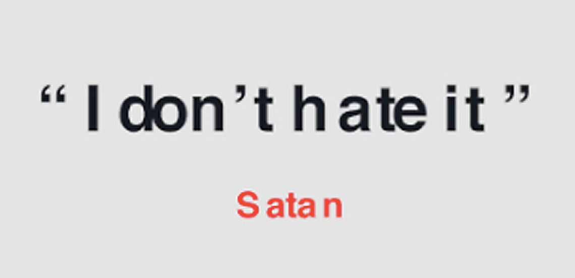
But Halloween creative stunts aren’t all bad. I love Matthew James Woodward and Zack Roif, both Associate Creative Directors at R/GA New York, for creating “Hellvetica”. It’s a hideous version of the ever-popular and famous typeface Helvetica, afflicted by insanely bad kerning. I sincerely recommend a visit to
https://hellveticafont.com/ which is simple and amusing. You can also download the Hellvetica font for free and, as it says on the website, “Kern in hell”. It’s more fun than a zombie eating your brain.
If you don’t understand the joke you probably don’t know the term kern. The following explanation will help, not to make the joke funny - that’s not how jokes work - but it will enlighten you a little. The kern is the space between one letter and another. Kerning is what nice people do to make the space between individual characters visually uniform and pleasing to the eye. They do this because sometimes what comes out automatically when you type on a computer is an abomination (especially if you use Hellvetica as a typeface). Not convinced? Try this: fire up your word processor, type ‘Wonderful!’, make the text size 72 or bigger and choose Arial as a typeface. Now, look at it carefully. See how the space between the ‘W’ and the ‘o’ is a little excessive compared with the majority of the other letter pairings? See how the ‘r’ scrunches into the ‘t’? If you don’t see it go away and don’t come back here.
If you do see it then you won’t be able to unsee it, ever. You are now one of us. We have various names but typographer and graphic designer are the most well known. We see things others don’t see and know things others don’t know like, for example, that kerning is not the best way to fix the spacing between the ‘r’ and ‘t’ in our ‘Wonderful’ example. For that, you need a ligature - a special character that combines two (or sometimes three) characters into a single character. Meet me at the cemetery at midnight and I’ll tell you more.